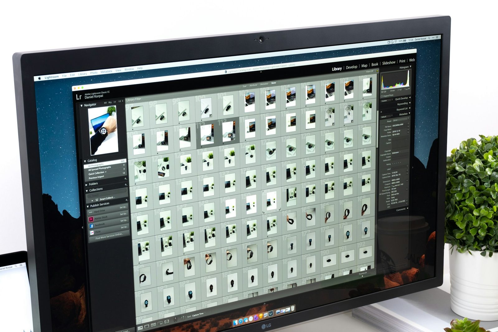
When Whisk asked us for a design system, they had 214 components in their design file and no two screens that agreed on the size of a button. Six hundred recipes, three platforms, and a component for every one-off screen anyone had ever needed.
We gave ourselves six weeks, and spent the first one not designing anything. We printed every screen in the app, laid them on the studio floor, and circled every element that did the same job as another one. By Friday the floor was mostly red.
Cut first, name second
The temptation with a design system is to start with the tokens: colours, type sizes, spacing. We started with the cuts instead. Every component had to earn its place by appearing on at least three screens, or by doing something nothing else could.
- 214 components became 48, each with a usage note and a code example.
- Nine greys became four, and every one of them passes contrast on white.
- Spacing moved to a scale of eight steps, and the one-off 13px margin went for good.
The system is not the file. The system is the conversation the file lets designers and developers have without us in the room.
Maya Okafor, design lead
Weeks two to five were the unglamorous part: rebuilding each surviving component in code alongside the design file, so neither could drift from the other. The last week was handover. Whisk’s own team now runs the contribution process, and the last time we checked, the count was still 48.




Leave a Reply