Lumo helps people build small daily habits, and its first three screens used to lose half of everyone who installed it. The old onboarding asked for a name, a goal and notification permission before showing a single thing the app could do.
We turned it around. The new onboarding is three illustrated screens that show what a week with Lumo looks like, and it only asks for a goal once people have seen why it matters.
One character, many moods
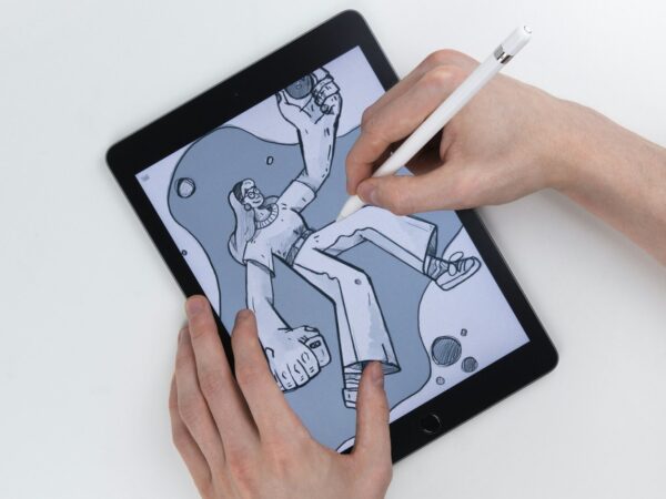
Sofia drew a single character who appears on every screen, in a different mood each time: sleepy, curious, pleased with herself. Reusing one figure kept the illustrations consistent and made them cheap to extend when Lumo adds features.
Every illustration is built from the same six colours as the interface, so the drawings sit inside the app rather than on top of it. Completion of onboarding went from 51% to 78% in the first month.