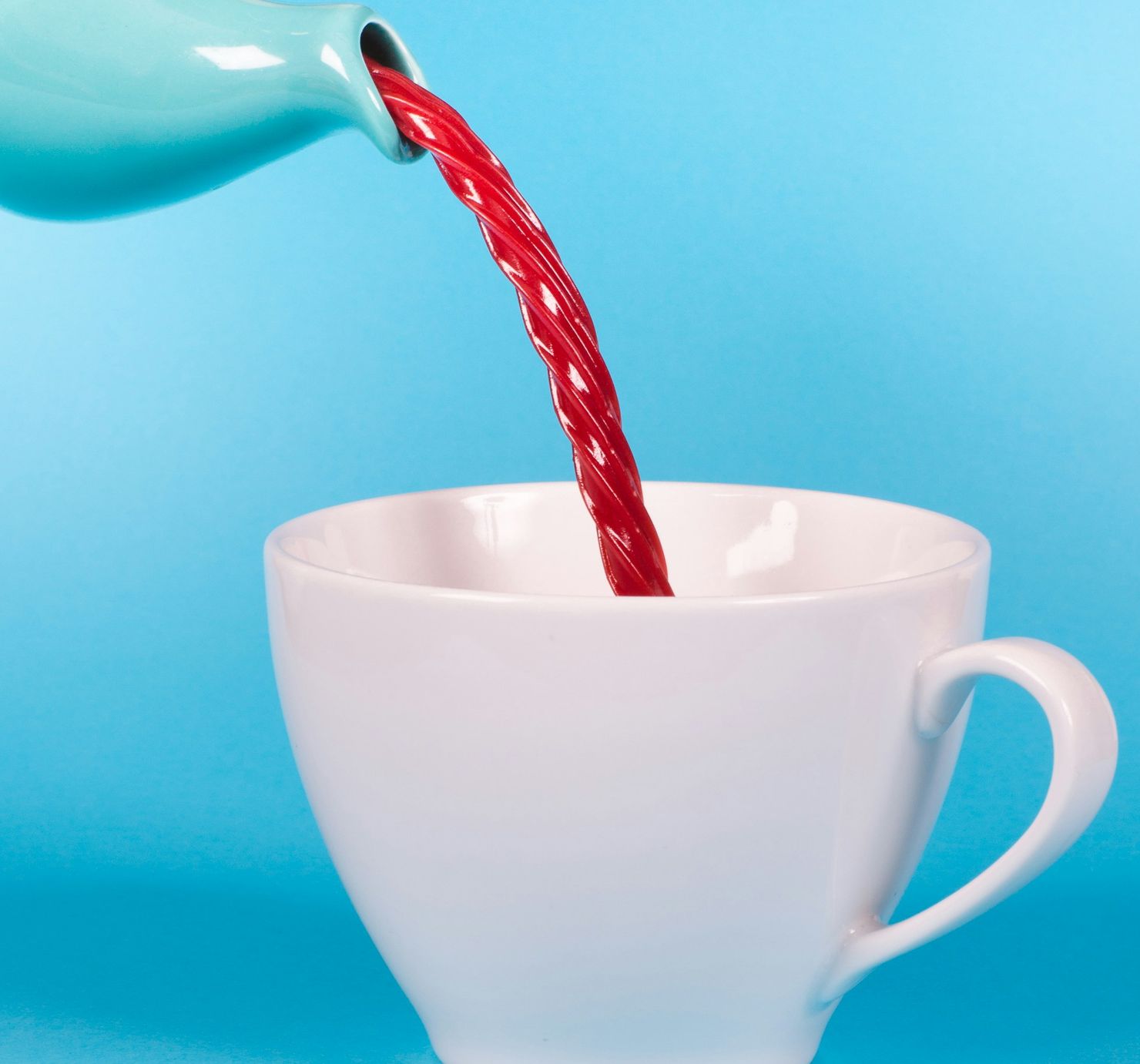
The tea tastes of cherries and liquorice and almost nothing of tea, and the client wanted the packaging to warn people kindly. We tried words. Words made it sound like a medicine. So the identity became one picture: a red rope of liquorice pouring out of the pot where the tea should be.
Three colours carry the whole brand — the teal of the pot, the red of the pour and a white that is a little warm so it never looks clinical. The logotype is set in the red, and nothing else on the box is allowed to be.

Leave a Reply