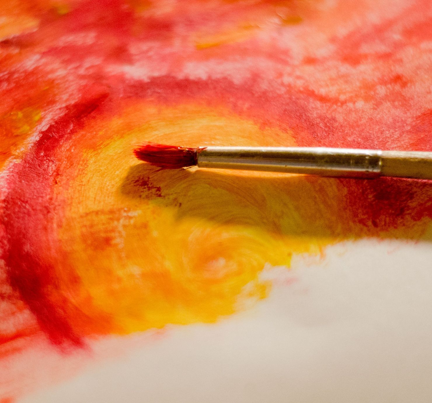
Every few years I try to give up cadmium red. It is expensive, it is toxic if you are careless with it, and there are perfectly good modern reds that cost half as much. Every few years I come back, because none of them sit on the canvas the way it does: opaque, warm, and somehow heavier than the colours around it.
A red that looks like it has weight. That is what you are paying for.
Pulled through orange and yellow, as here, it glows at the edges where they meet. Over a cool colour it goes almost brown. It is the least forgiving paint I own and the one I would keep if I could keep only one.

Leave a Reply